
Spend enough time trawling through social media posts with a #DOC somewhere in the hashtag, and it is inevitable that you will see photos of people’s CGM graphs. Often, it’s PWD getting excited at their flat line graphs because they have managed to stay within range for a certain period of time. Or perhaps it’s to show shock and utter disbelief at loop systems doing all the work. It can be because we won’t to show how we have managed to nail the timing and amount of a bolus, and that usually-difficult to manage food nemesis (hello, rice!), completely avoiding a spike. Or, it could be just because we feel like sharing.
I don’t share my graphs a heap these days, but have in the past. It’s a personal decision as to whether we want to share their data online, and if you do, knock yourself out. Your data, your rules! I understand why some feel that it can be considered not especially helpful for others, setting us up to feel we are failing if we compare. But the conversation sharing can generate is really useful for a lot of people.
Every now and then, a non-PWD will share their libre or CGM trace to show that even those with a perfectly working pancreases are subject to glucose fluctuations. This is done with the intention of support and encouragement and to show that flat lines really are unrealistic. While I’m sure that those sharing glucose graphs of people without diabetes is never done with any malice – in fact, completely the opposite – I believe it is nonetheless problematic, and misses the point.
I get it. It’s a noble goal to try to make PWD feel less negative when we are unable to manage a perfectly flat line at 4.0mmol/l for hours on end. And to also understand that’s not how the body actually works, even when everything is doing what it should be doing.
But it is totally redundant. And downright annoying. And also, completely inconsiderate.
I live with diabetes and am fixated on trying to limit the variation of my glucose levels because I have to. PWD are told that keeping those numbers between 4mmol/l and 8 mmol/l is the goal. And we’re told that when we go outside of those numbers – especially when we go beyond the upper limit, all manner of nasty things will happen to us. That’s what was told to me the day I was diagnosed with diabetes, and repeatedly what I have seen since.
Showing me your graph that just happens without any effort on your part is not reassuring. It’s pointless. And somewhat heartless. When your level goes up to 12 because you ate a family block of chocolate, it comes back in-range fairly quickly. And not because you had to do any fancy-pants calculations, or micro (or rage) boluses.
When I eat a block of chocolate, whatever happens next is pretty much 100% due to my efforts. I have done some fancy pants calculations. I have had to bolus – maybe once, most likely a number of times – to get my glucose level back in range. And then I sit there and hope that I haven’t over bolused…
Oh – and when you show me that your glucose levels dipped into the low range or sat there for a while, it doesn’t reassure me or make me feel ‘normal’. Because the difference is that when that happens to me, I am doing all I can to make sure that I am okay, that I don’t pass out, that I don’t overtreat (again!), and that I am safe. And then I get to recover from a hypo hangover – something you are fortunate to never experience.
To be honest, I actually find it completely ironic when it is HCPs sharing their data to make me feel better, and a little thoughtless because the reason that I am in constant pursuit of these straight, tightly-in range lines is because it is HCPs that told me in the first place that is where I must stay to ‘prevent’ all.the.nasty.things.
And finally, when this happens, it centres people without diabetes in a conversation that should very much have the spotlight firmly shone on us. Your glucose level data, and the patterns they make are not like ours. They do not represent the blood, sweat and tears, the emotional turmoil, the frustration, the fear that that is somehow reflected in our data.
Perhaps rather than sharing non-PWD data, instead acknowledge just how difficult it is to do diabetes, and commend people with diabetes for showing up, day after day, to do the best we can – regardless the shape of our CGM graph.
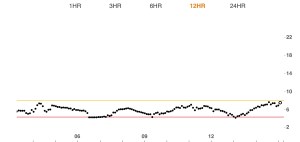
A real-life PWD CGM graph. Mine, from about 10 minutes ago.


2 comments
Comments feed for this article
August 8, 2020 at 10:55 am
Min
Huh Renza! What normal human shows their perfect flat line? and why? You are dam right, it is not helpful but a bit sarcastic I feel. Oh god yes, a ton of effort and work and worry and guilt and food, emotion, movement, injecting, testing, calibrating and more guilt goes into a perfect flat line for us. I am perplexed at the comparison as there is none what so ever! Our flat line is a underpaid, no annual leave or no sick leave, full time job!! And oh goodness yes Rice, it nearly puts me in coma!!! Have a great day Renza.
LikeLike
August 8, 2020 at 12:27 pm
Rick Phillips
I dislike it even when PWD’s show their CGM graph. I mean for what reason? Are we entered in a flatness contest. Do all non PWD’s win? Do those who have been PWD’s for a month always win? If not do we need to get into categories like marathon runners? Well I am over 60, with diabetes 46 years, with red hair (it used to be), and I drive a Nissan is that a category?
Are we going to set up a conversion formula so we can take out the variance. If not then really i am good not seeing yours.
Now to be fair when a person achieves something, walks for 5 hours with no low, or some one who is doing terrific wants to brag a little that is wonderful. show it off, but not every day.
I like supporting my fellow PWD’s and i wish them well. What I will not do is compare with you, or others. Data is not a weapon, it is still just data. Enjoy a good day, I will suffer the bad days with you, but lets keep the data private.
As for non PWD’s who share their data, I will rely on what my son used to say
“ain’t no fool wanna see that crap”
LikeLike